
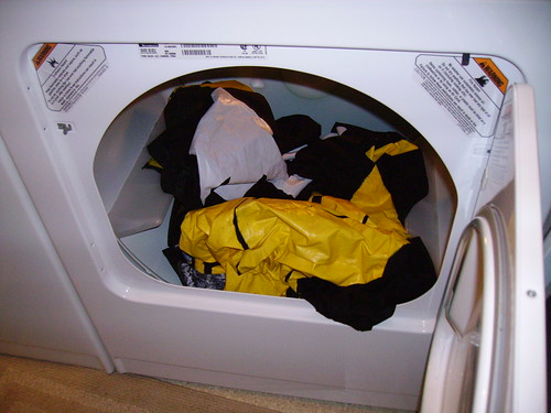
 It rained for the majority of the match versus Real Salt Lake last night. The good guys, Columbus, won the match 1-0 on a penalty goal from El Mellizo (Barros Schelotto). The banners I've made are strong and durable, something that I take pride in. Using exterior latex/acrylic paint is always the paint of choice because of elements such as long rains. Mold and mildew will have a hard time with this paint, but there is still the issue of the unpainted sections of fabric. So I come home and take a risky idea. Instead of having the banners air dry which is a tedious process, I decided to put them in the dryer. Talk about one solid risk with results! Not only did it only take 30 total minutes to dry them, but also the paint didn't chip, run, melt, stain, or destroy the inside of the dryer.
Sunday, April 25, 2010
Victory in the Rain
It rained for the majority of the match versus Real Salt Lake last night. The good guys, Columbus, won the match 1-0 on a penalty goal from El Mellizo (Barros Schelotto). The banners I've made are strong and durable, something that I take pride in. Using exterior latex/acrylic paint is always the paint of choice because of elements such as long rains. Mold and mildew will have a hard time with this paint, but there is still the issue of the unpainted sections of fabric. So I come home and take a risky idea. Instead of having the banners air dry which is a tedious process, I decided to put them in the dryer. Talk about one solid risk with results! Not only did it only take 30 total minutes to dry them, but also the paint didn't chip, run, melt, stain, or destroy the inside of the dryer.

Wednesday, March 24, 2010
Throwback!
While doing spring cleaning of sorts, low and behold I found two folders with some sketches of Columbus players from probably around 2001/2002 years. I laughed out loud thinking about then and the current comics that I've been doing now. Looks to me that I had better skills back then, in terms of proximity to accuracy. The uniforms I sketched came from an idea I had while looking at older uniforms from the 1920's and '30's from teams globally. I would imagine if Columbus had a nostalgia night what the uniforms might have looked like.


Sunday, March 21, 2010
Preparing For Crewsmas
 The first match of the 2010 season vs. Toronto at home is coming up this weekend and so that means it was time for me to get my banner plans ready for the Saturday. And yest I sit here on this lazy Sunday afternoon, I still find the need to do another banner or two. This week is known as "Crewsmas" by us Columbus Supporters, a play on words with Christmas, and all the goo tidings of joy that holiday brings. Crewsmas is a special time of year to me personally for several reasons. The first is the two and-half hour trip to Columbus and the thoughts of the camaraderie of being amongst the Nordecke, singing and chanting. Secondly, a new season, means new hopes and just seeing our team playing after a long winter off season is good for morale. Another reason I like Crewsmas is because I can start to plan more banner ideas. This first match the supporters in Columbus, Ohio have planned a tifo display for the first match. The details have been kept under strict confidentiality, but I can't wait to do my part in helping with the atmosphere.
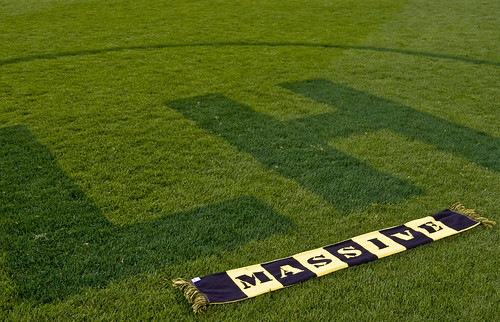
The Concept of MASSIVE
 Columbus supporters use the term MASSIVE in several ways. But in my humble opinion, Michael Arace from the Columbus Dispatch newspaper best describes the term as such:
To say that Massive is an us-against-the-world thing is to identify the core concept -- and to oversimplify. Massive is uniquely Columbus. It embodies years of frustration. It takes into account the perception that the city is some isolated backwater lacking in the sophistication of those glorious metropolises, Cleveland and Cincinnati. It operates, rightly or wrongly, on the theory that nobody on the outside -- owners, league officials, referees, media -- is prepared to cut the local side a break. It assumes added impediment and girds to go beyond.
To be Massive is to overcome. And to overcome, one must be Massive.
Saturday, March 6, 2010
Early 2010
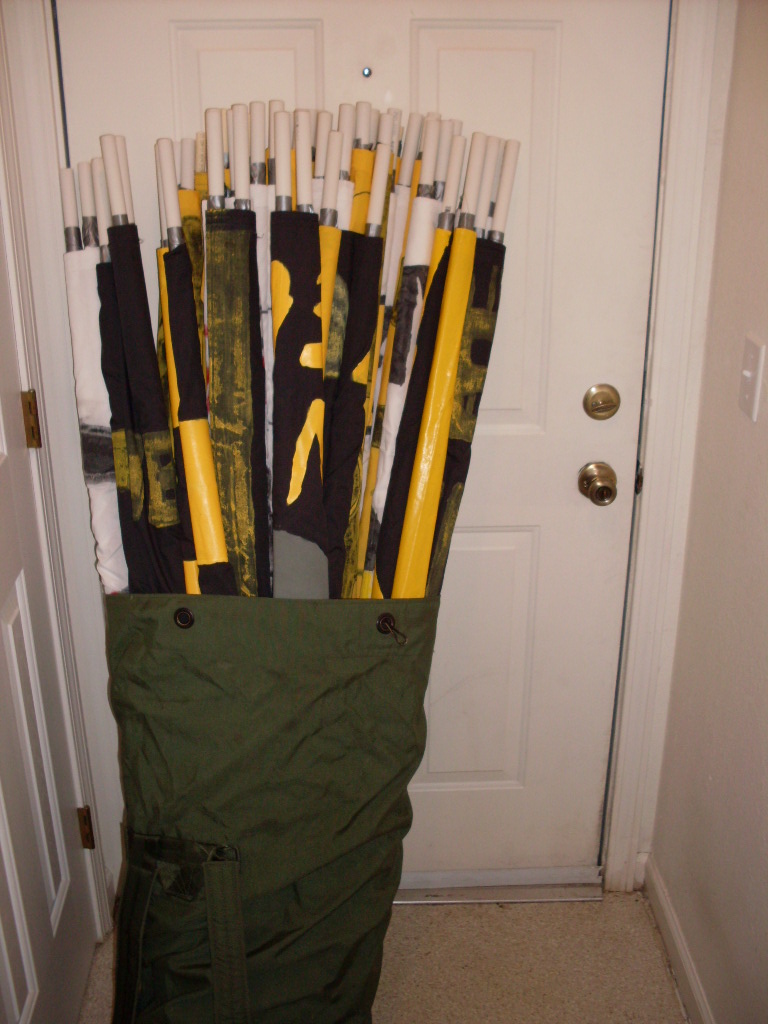
These are the banners I've made so far in 2010. There's also another 12 yard long banner made that isn't shown here. So with that in mind, the following:
Inspired by rap group Public Enemy, this idea came about as the Nordecke section in Columbus and its supporters have traditionally been under the radar by the league, club, and opponents (for throwing things on the field during corner kicks, a fight with quasi-West Ham supporters in a friendly, vulgar chants, one single ignorant racist fool caught on video, and other small acts of tomfoolery). But in that regard, the section does have overriding positives. But opponents will always point out the negatives, no matter how old in time they occurred. So that makes a supporter of Columbus "Public Enemy".

Cityscape of Columbus, Ohio. I thought about sun rays in the sky, like the State of Ohio's seal, but instead I kept true to the motif of the club, America's Hardest Working Team. The black and yellow warning stripes look better anyhow, don't you think?

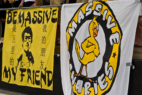
The new and improved MASSIVE banner. Once again I use the warning stripes.

Out of extreme boredom, I was watching parts of a Sonny Chiba movie and decided to do a banner of this classic movie turn manga turn anime series turn video game. Can you guess which one that is?

Inspired by rap group Public Enemy, this idea came about as the Nordecke section in Columbus and its supporters have traditionally been under the radar by the league, club, and opponents (for throwing things on the field during corner kicks, a fight with quasi-West Ham supporters in a friendly, vulgar chants, one single ignorant racist fool caught on video, and other small acts of tomfoolery). But in that regard, the section does have overriding positives. But opponents will always point out the negatives, no matter how old in time they occurred. So that makes a supporter of Columbus "Public Enemy".

Cityscape of Columbus, Ohio. I thought about sun rays in the sky, like the State of Ohio's seal, but instead I kept true to the motif of the club, America's Hardest Working Team. The black and yellow warning stripes look better anyhow, don't you think?

The new and improved MASSIVE banner. Once again I use the warning stripes.

Out of extreme boredom, I was watching parts of a Sonny Chiba movie and decided to do a banner of this classic movie turn manga turn anime series turn video game. Can you guess which one that is?

Wednesday, January 27, 2010
CREWiSM

This off season I thought I would be making a buffet of banners and two-sticks. I've only made three because a hobby from my past crept back into my life. It's a hobby that has come to the point where this will probably become a full-time thing, if not this season, surely for future ones.
I started drawing cartoon-like caricatures of baseball players in Japan in the late 1990's. I stopped but have brought the drawings back in the form of the Columbus Crew Soccer Club. Part of my several likes of Japanese things is the anime/manga. I would decide that the name of my comic would be CREWiSM. How did I come with this title? Well, honestly, my wife came up with the name and I found the font. The suffix -ism in CREWiSM can best be define this title as things Columbus Crew, but in a gag comic sort of way. The font for the title is called Bad Mofo, which I consider the Columbus team to be, out of my own bias. If broken up, the word Crew Is M in bad English could stand for Crew Is Massive.
Tuesday, January 26, 2010
2009
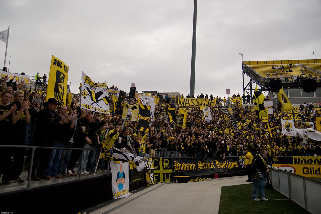
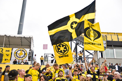
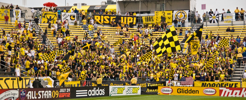
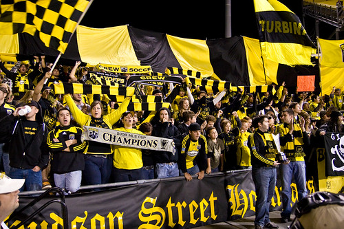
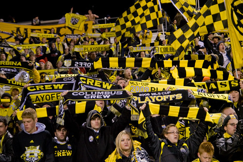
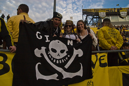
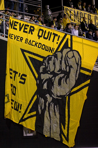
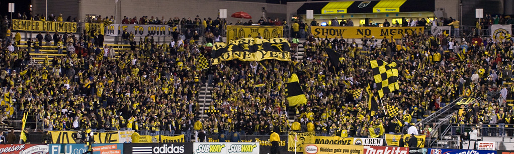
No need to go over why the hiatus from this blog. In a nutshell, I've been working on gag comic/manga called CrewIsM. More on that later. For now, it's time to catch this blog up from where I left off. Columbus had the best overall record in the league once again in 2009, yet due to the second-chance nature of American sports, the Crew didn't win the playoffs. But 2009 saw some nice carryover value in terms of displays of passion. I'll just let the pictures do the talking.




Subscribe to:
Posts (Atom)